Competitive Intelligence
Competitors Analyzed
Huma Gel, Spring Energy, UnTapped, Muir Energy, Honey Stinger
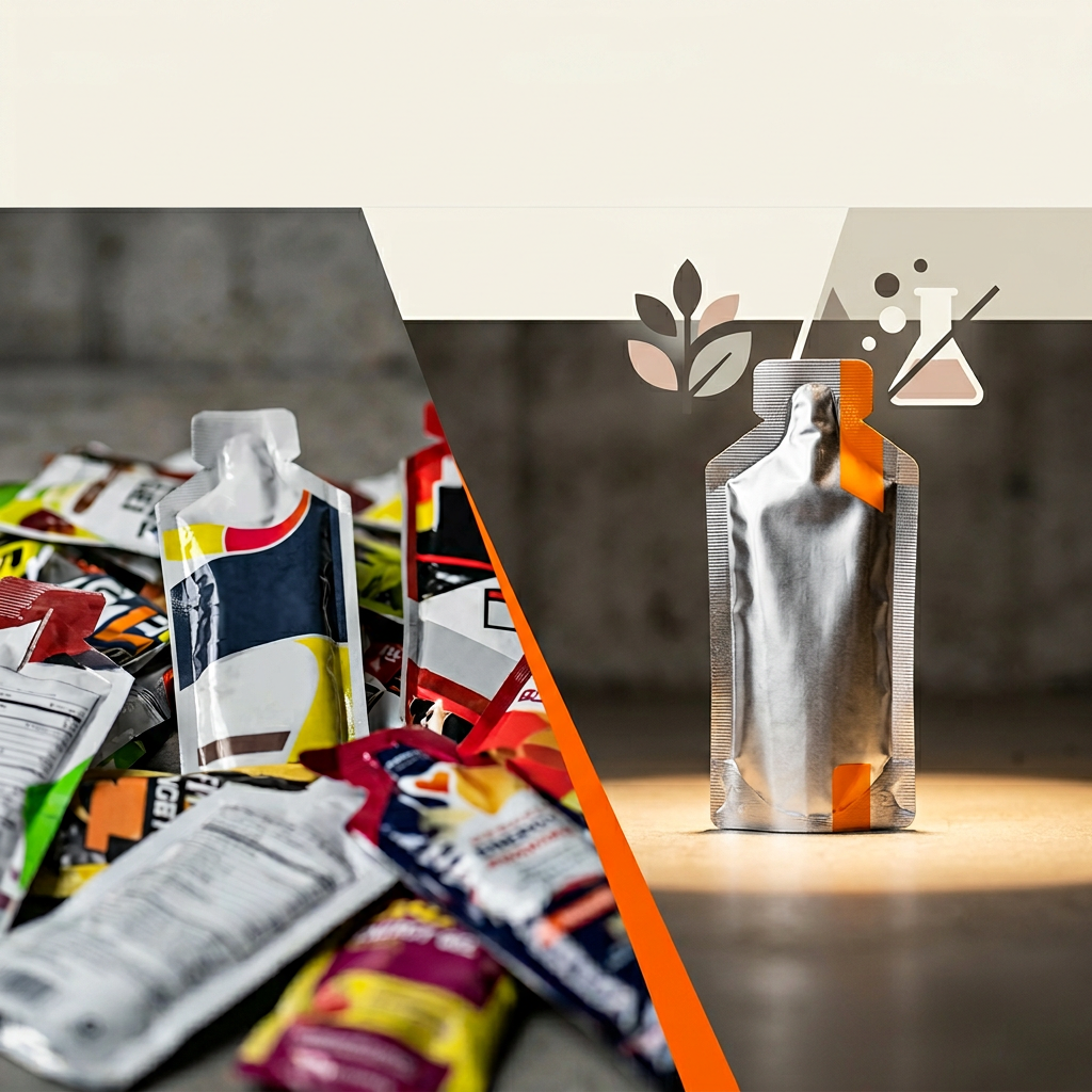
Whitespace (Exploit)
Bold graphic illustrations; High-contrast color blocking; Stomach-specific benefits; Simplicity as strength (only 2 ingredients)
Saturated (Avoid)
Athletes mid-run/bike; Ingredient drizzling shots; Real food fuel; Natural energy
Our Angle
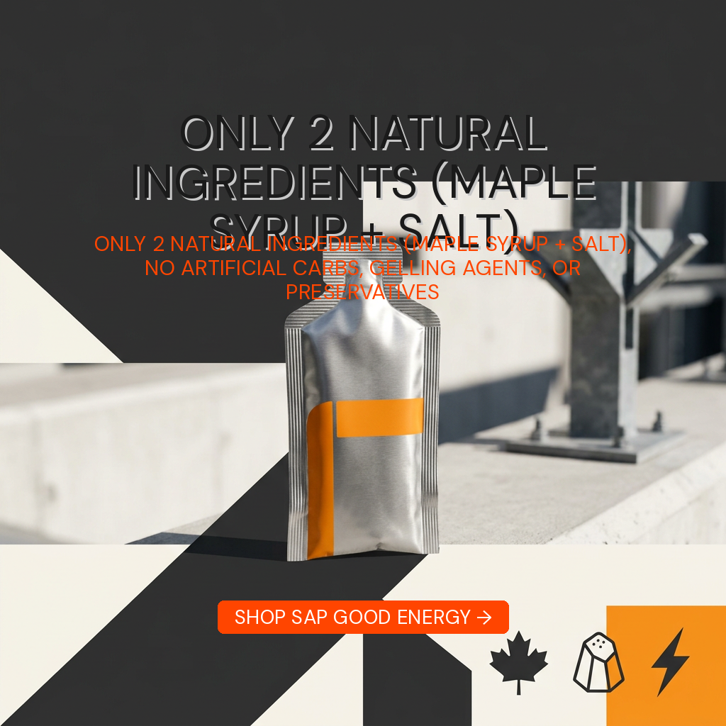
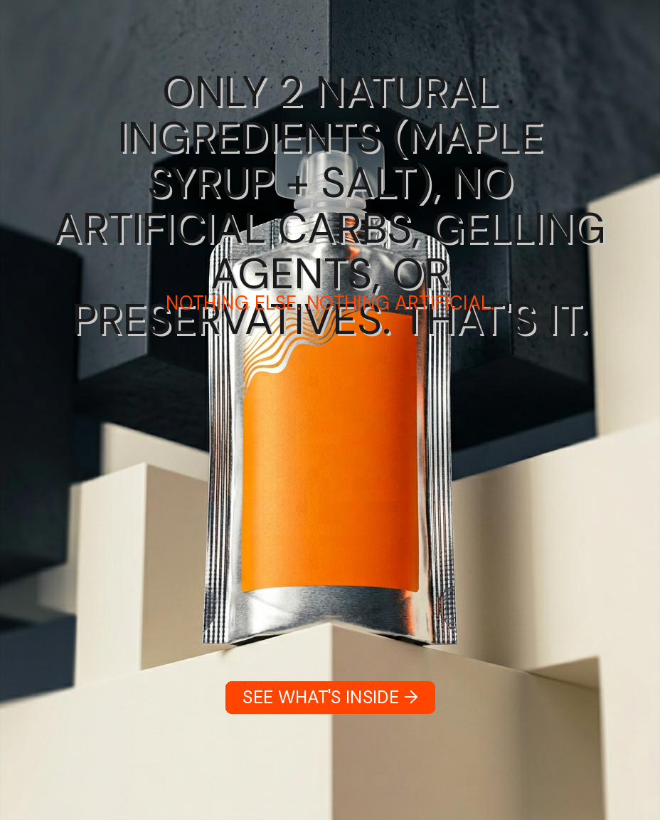
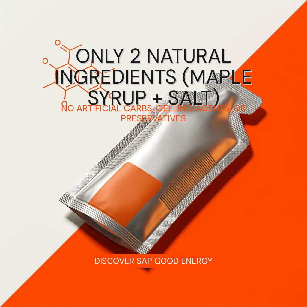
Radical simplicity - only 2 ingredients while competitors use 8-15
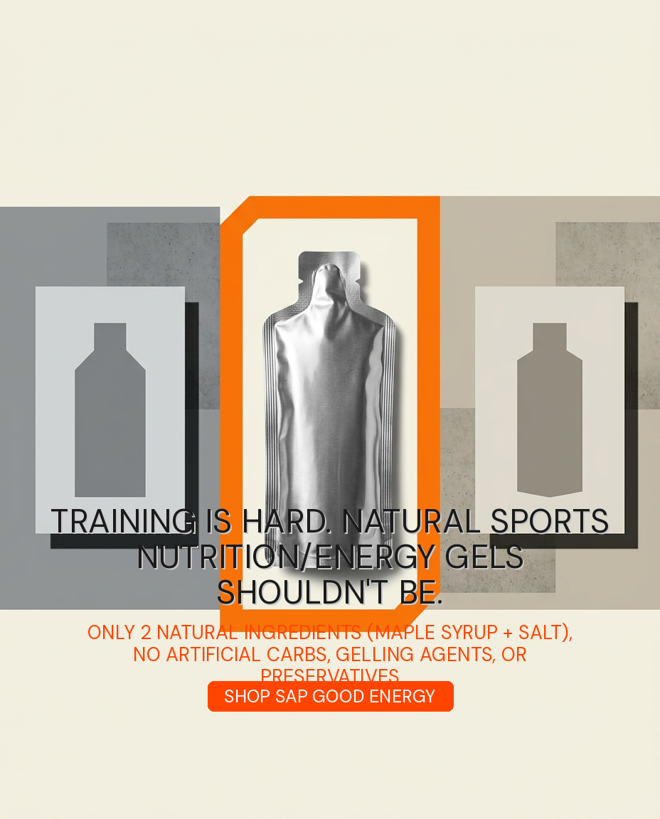
4Headline/Hook Ads
 6.5
6.5
 5.0
5.0
 4.2
4.2
 7.4
7.4
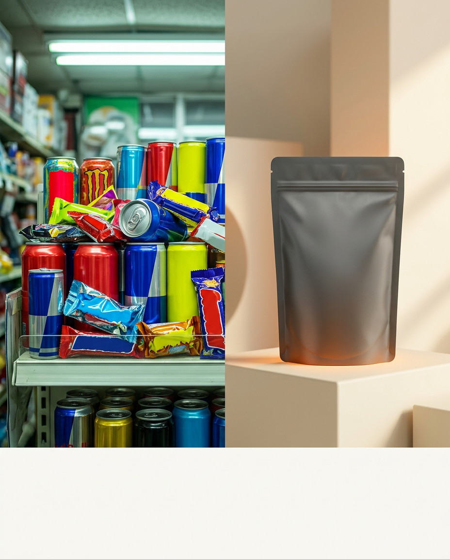
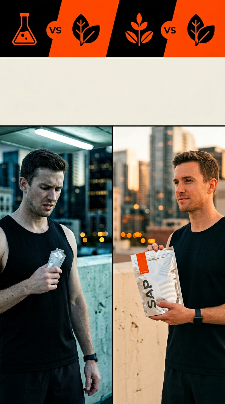
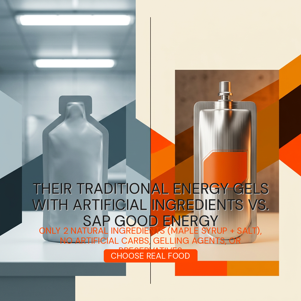
6Us vs. Them Comparison
 7.6
7.6
 3.4
3.4
 7.6
7.6
 4.2
4.2
 6.2
6.2
 4.6
4.6
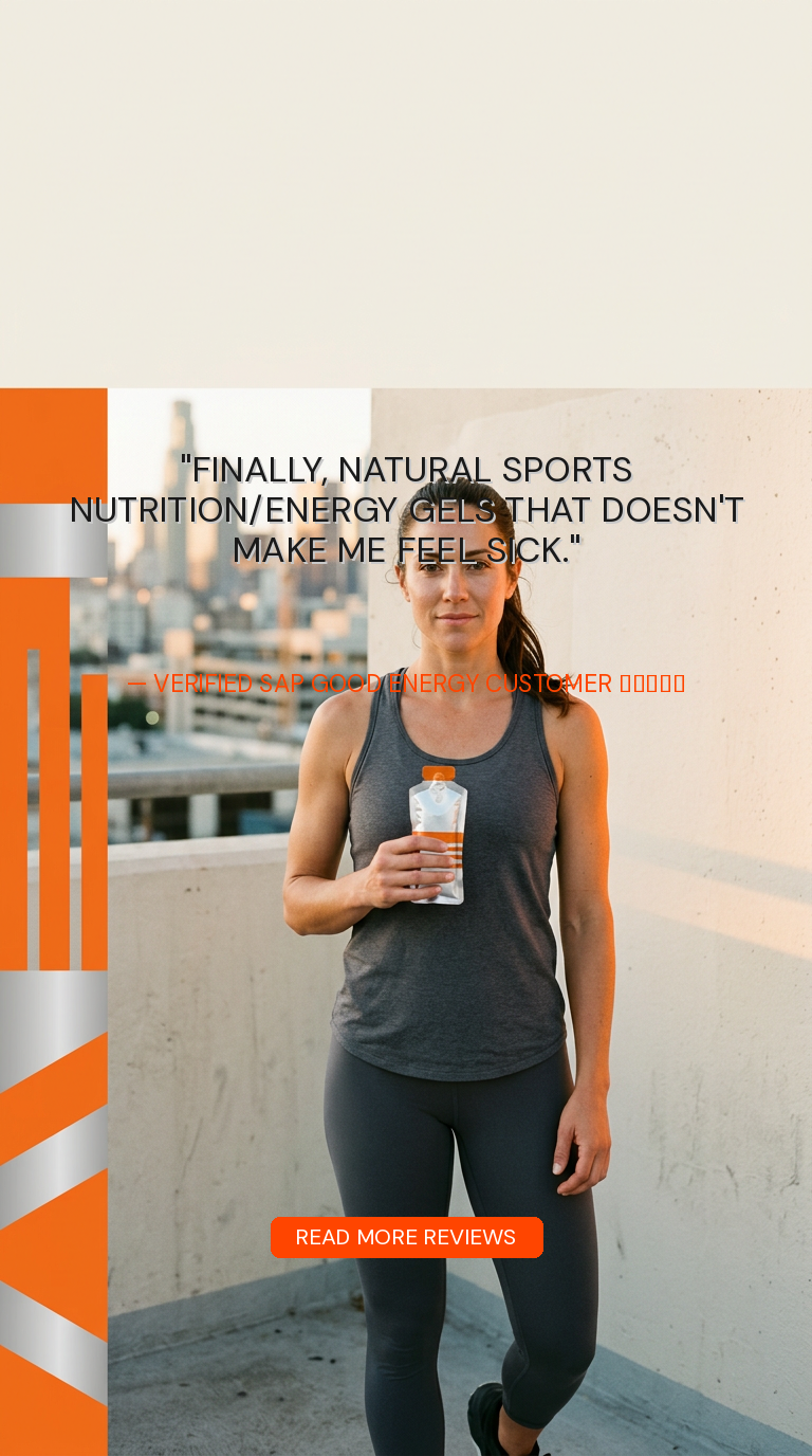
4Testimonial Ads
 4.7
4.7
 4.6
4.6
 4.6
4.6
 4.4
4.4
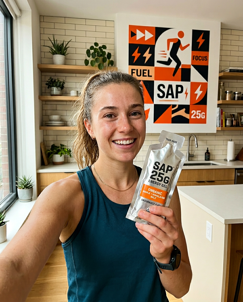
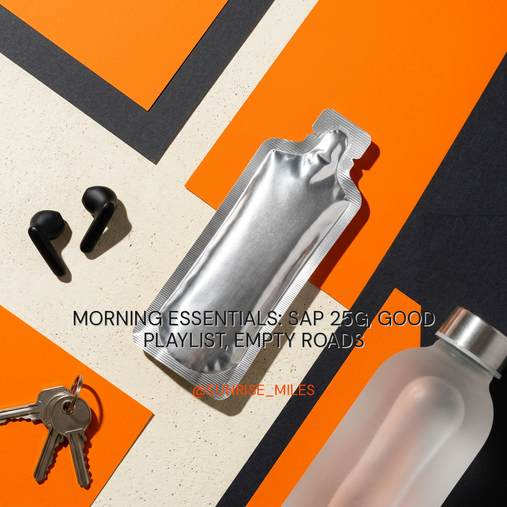
4UGC-Style Ads
 7.4
7.4
 4.6
4.6
⚠ failed
 7.6
7.6
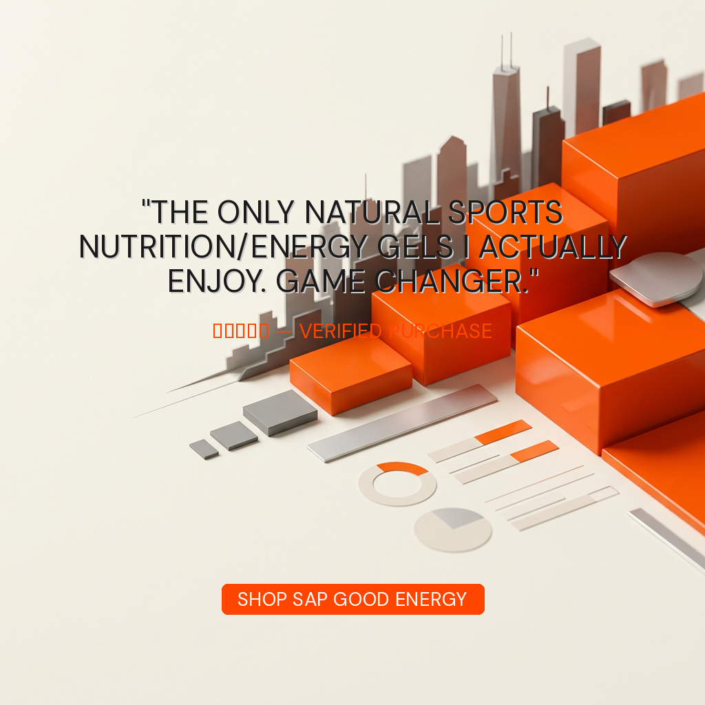
4Review Card Ads
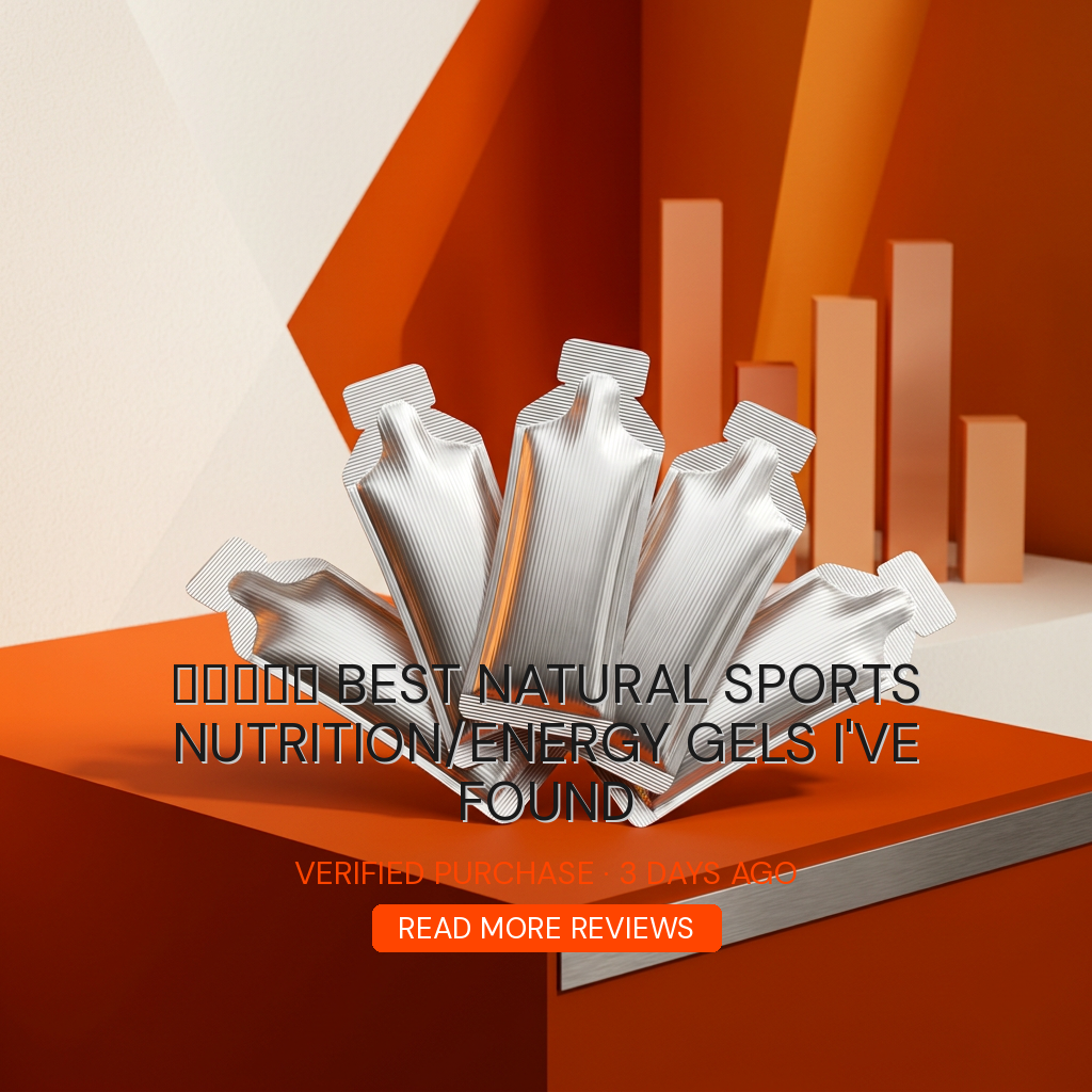 4.6
4.6
 4.2
4.2
⚠ failed
⚠ failed
6Stat/Callout Ads
⚠ failed
⚠ failed
⚠ failed
⚠ failed
⚠ failed
⚠ failed
2Before/After Ads
⚠ failed
⚠ failed
5Founder Story Ads
⚠ failed
⚠ failed
⚠ failed
⚠ failed
⚠ failed
3Benefit-Stacking Ads
⚠ failed
⚠ failed
⚠ failed
2Urgency/Offer Ads
⚠ failed
⚠ failed